

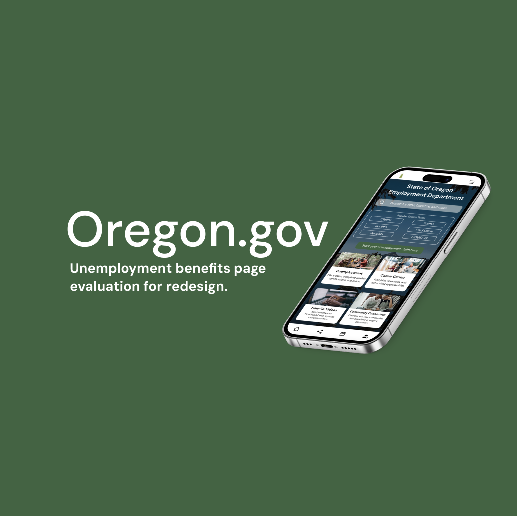
Oregon.gov
Unemployment benefits page evaluation for redesign
Problem Statement——————
How might we redesign the Oregon.gov unemployment benefits website to make navigation easier, streamline information, ensure consistency with the parent site, and foster a sense of community for users during their employment journey?
My Role: UX Researcher
Timeline: 6+ Weeks
Tools: Miro, Figma, Zoom
Research Objectives——————
Understand how to align the unemployment site with the design of the main Oregon.gov site.
Identify user needs for ease, speed, and comfort in navigating the site.
Explore ways to enhance empathy through improved accessibility and on-site support.
Methods———————————
Hypothesized User Persona- to better understand our user's motivations, needs, and pain points in order to inform design decisions and create a more user-centered experience.
Content Inventory- to identify gaps and inefficiencies on the Oregon unemployment website. This helped us better understand the content and structure, enabling us to highlight 4 major areas in need of improvement.
A/B Testing- to evaluate whether adding a call-to-action (CTA) button would enhance users' ability to navigate the unemployment process, allowing us to validate our hypothesis with measurable data.
Research Findings———————
Key Challenges
Navigating the Oregon unemployment website is challenging and frustrating for users, particularly those applying for benefits while also searching for jobs. The site lacks easily accessible, situation-specific information, adding to users' difficulties.
Content Inventory Insights
Our content inventory identified four focus areas for improvement:
Hierarchy
Ensure consistent paragraph blocking and stylization for buttons, headers, and bolded elements.
Remove redundant information for clarity.
Language
Use plain, jargon-free language with clear explanations.
Align the tone and branding with the homepage for consistency.
Video
Include labeled headings for YouTube links.
Place videos at the bottom of pages for better flow.
Images
Ensure images are relevant to page content.
Use consistent icon styles and avoid duplicates.
A/B Testing Results
Users who tested the site with a CTA button (Group A) reported higher support during the application process, scoring 4.3 out of 5 on average.
Test A users completed the process faster, with fewer unnecessary steps, compared to Group B, who lacked the CTA button.
Findings confirmed that the inclusion of a CTA button improved navigation, reduced confusion, and enhanced the overall user experience.
Retrospective—————————
What Went Well
Content Inventory: Although the process was tedious due to the disorganized and overwhelming amount of information, it gave us a clear understanding of what needed to be improved. This insight allowed us to create a more empathetic and straightforward design approach.
A/B Testing: A/B testing was an efficient and effective way to validate our hypothesis that a call-to-action (CTA) button on the landing page would improve user navigation. The positive results demonstrated the value of small, strategic changes.
Areas for Improvement
Further Testing: Additional A/B tests could provide even more valuable data as the design evolves. Iterative testing would ensure that future design decisions are consistently validated.
Next Steps
Conduct user testing on high-fidelity clickable prototypes for both web and mobile versions to gather measurable feedback on usability and functionality.
Speak with subject matter experts in unemployment insurance to gain a deeper understanding of the system's inner workings, ensuring the design aligns with user needs and operational realities.